Archives for category: swatch

Hi guys, my China Glaze Island Escape set came in! I’m not that crazy about this set, I was convinced after seeing some really awesome swatches but on me… They’re just meh.

Overall notes:
Formula is fantastic; unique colors that do remind me of an island
The cremes are great, although I’m not a raging fan. Two coats for all the cremes.
The shimmers are sheer (see Senorita Bonita, Cha Cha Cha, 108 Degrees and Blue Iguana) and they were three or more coats.

The Shimmers:
108Degrees
108 Degrees

ChaChaCha
Cha Cha Cha, a lime green shimmer. This reminds me a ton of Zoya Apple, and I like Zoya Apple a lot better.

BlueIguana
Blue Iguana

SenoritaBonita
Senorita Bonita, a light purple-almost fuchsia (this picture pulls too slightly purple)

The Cremes
PapayaPunch
Papaya Punch. This is really the color of a slightly underripe papaya. This is such a strange color, and I’m not sure how comfortable I am having it on my nails. Pedi color maybe. Or to stamp over.

ElectricPineapple
Electric Pineapple. This color reminds me of something from Illamasqua, maybe Radium. Again, another weird color on me and it’s pushing my comfort zone :\

Thoughts anyone?

So being the geek I am, when I found the a-england polish site I had to buy them all because OMG AWESOME NAMES. They arrived about last week (or maybe two weeks ago, okay, I’m kinda behind) and while I was staying up with Nick supervising him doing his homework, I swatched them all.

General notes before we begin:
— Most are two coaters, with the exception of Merlin, which is one-coater.
— No topcoat, only basecoat
— Formula was great with them all with a few exceptions
— I am still not exactly sure if they are deserving of their price tag, as the bottling and formula is kind of typical and their colors are not extremely unique (however beautiful).
— I am extremely, I mean EXTREMELY surprised there are no greens in this collection!! Green is a very medieval color, at least to me.

Here we go.

 Dark purple duochrome, with a slight blue flash.
 Excuse the horrid picture. Camelot is a gorgeous black, with a brown base and is an one-coater if you’re careful.
 Elaine is a very dusty purple/gray and I love it. Very muted, a nice color.
 There’s a saying among us nail bloggers– everyone needs one nice silver foil in their collection, and I can definitely say this one is mine. Not to mention the kickass name 😉
Galahad is an interesting light blue. This picture makes it look like a shade of the sky blue family but I would say it borders on being teal. Again, another favorite. 
 Guinevere is a dusty lilac creme. Pardon the hair on my ring finger– a piece of the cotton ball I used earlier.
 Holy Grail is a very nice warm gold, with a shimmer.
 This one kind of gave me trouble. A very pale sheer pink, almost a french pink. The formula was an issue and even after THREE coats there’s a visible nail line up there. The brush on this one was wonky too, and threw me off.
 Grey duochrome with a hint of … I don’t know? Green?
 Dark purple holographic goodness! I love this one too.
 Lancelot.. Good lord it’s an extremely dark plum. It’s pretty much another black. I included a picture of the first coat, so you can see its true color.
 Merlin is a silver glitter suspended in a clear jelly base. Extremely dense, what you see above is one coat.
 A sheer duochrome silver/white/pink, great for layering. Three coats above and it’s still sheer which is why I think it’s for layering on other polish (something I haven’t tried, this was swatched at the end– dammit)
 Lovely red. This is THE red, for me. Shimmery.
 Blue holographic goodness. What’s the difference between Tristam and Lady of the Lake, I asked myself? See below.
All two coaters, but you can see Lady is more pulling on purple while Tristam is on the navy side.

Thoughts? 😉 

Here is the other half of the Zoya Summer 2011 collection, Summertime. This is a six piece collection featuring cremes.

The polish was two coater in all of the pictures. Had VNL issues with the red ones, but mainly not too terrible. Formula was stellar. I love Zoya although their price tag could go down a little bit more. 🙂

Areej

Love Areej! Such a nice take on the Pantone 2011 Color of the Year: Honeysuckle color.

 Areej, a very strong fuchsia.

Breezi

This is a bit darker in real life. My camera, and the uploading process washed it out 😦

 Breezi, an interesting blue. Almost teal, almost periwinkle. I looked this color up and it seems to match Munsel Blue, according to Wikipedia’s list of color drops (the little blue square above).
Kieko

Very dark fuchsia creme.

Mira

Great purple creme, this photo shows a bit too purple. It’s a lot more “pastel” (washed out) than the photo showing.

Sooki
 Sooki is a very cool cherry red. It’s the perfect red creme! I don’t LOVE this because the name reminds me of that horrible Snooki from Jersey Shore and I can’t stand her. 😦
Tamsen
Tamsen is a much warmer red– you can see it has a lot more orange than its sister Sooki above. Dark tomato red. It leans a lot towards the orange side than Sooki, who leans towards cherry. 
Love these cremes… I could do without the two reds though. How about a green? 😉 
I also want to see Zoya name their polish after some REAL women, not these vapid beings that you see on trashy, brain-cell-slaughtering TV shows. =\

Here is the other half of the Zoya Summer 2011 collection, Summertime. This is a six piece collection featuring cremes.

The polish was two coater in all of the pictures. Had VNL issues with the red ones, but mainly not too terrible. Formula was stellar. I love Zoya although their price tag could go down a little bit more. 🙂

Areej

Love Areej! Such a nice take on the Pantone 2011 Color of the Year: Honeysuckle color.

 Areej, a very strong fuchsia.

Breezi

This is a bit darker in real life. My camera, and the uploading process washed it out 😦

 Breezi, an interesting blue. Almost teal, almost periwinkle. I looked this color up and it seems to match Munsel Blue, according to Wikipedia’s list of color drops (the little blue square above).
Kieko

Very dark fuchsia creme.

Mira

Great purple creme, this photo shows a bit too purple. It’s a lot more “pastel” (washed out) than the photo showing.

Sooki
 Sooki is a very cool cherry red. It’s the perfect red creme! I don’t LOVE this because the name reminds me of that horrible Snooki from Jersey Shore and I can’t stand her. 😦
Tamsen
Tamsen is a much warmer red– you can see it has a lot more orange than its sister Sooki above. Dark tomato red. It leans a lot towards the orange side than Sooki, who leans towards cherry. 
Love these cremes… I could do without the two reds though. How about a green? 😉 
I also want to see Zoya name their polish after some REAL women, not these vapid beings that you see on trashy, brain-cell-slaughtering TV shows. =\

I took part of Zoya’s BOGO promotion with their Summertime/Sunshine and Mod Mattes collection, and this one is the Sunshine collection.

General notes:

Two coats for almost all, unless otherwise specified. They all have gold flecks in them and the reds were not photographed adequately because I am a crappy photographer with a decent camera 😉 I personally love this collection, it’s wonderful for summer and definitely great for pedicures and nubby nails. I don’t really have any description for these, so I’ll just let the pictures talk. Enjoy!

Apple

Love this.

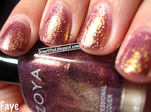
Faye
 Grape with a ton of gold fleck shimmer.  It also caught a ton of shine with my camera it was crazy. It’s my favorite too. I wonder why!

Kimmy
 Cherry red, more bolder than the camera allowed and of course the gold shimmer is muted way way down. I liked this one though!
Rica
 Strawberry pink with gold flecks 😉 awesome.
Tanzy

I love this one too. Orange with darker gold flecks.

Reva
This one is a lot more raspberry, and the camera refuses to show the gold fleck. The bottle color is accurate (without the gold shimmer), my nails are a bit muted down.
From left to right: Fault Line (dark  purple); Cracked Concrete (grey); Crushed Candy (light teal/blue– color is very accurate here!); Black Mesh (black); Broken hearted (pink, not as dark as shown) and White Lightning… which is white.

Quick photo of the collection. And yes, that is my work keyboard you see. It must be a really slow day here if I don’t get nagged at by the boss for the lacquer smell huh? 😛

 What did I do when I opened the package? Immediately put them on! I’ll do better swatches in a bit.

Thumb: Broken Hearted; Index finger to pinky: Cracked Concrete, Crushed Candy, Black mesh, and Fault Line.

White lightning– it did crack pretty well but my hindsight wasn’t 20/20 when I put it over Alpine Snow 😛

Design a site like this with WordPress.com
Get started