That’s right guys. When I swatched the CG Island Escape collection over white, I thought… hmmm.. something is uncanny here. Then I realized this “uncanny-ness” was found in a recent head2toe order, containing my Misa Paradise Shore! I matched them up, and the similarity is… well, mentionable. No exact dupes, that’s for sure, but the theme is strikingly similar!
Same color themes, same summer theme (Paradise Shore, Island Escape =) ) Their lab rats must have had the same wavelengths or something when they came up with this collection. Have a look:

Hmmm.. I’m onto you!
Before we begin the comparisons, I only compared five out of six possible matches. This is because Senorita Bonita, from China Glaze Island Escape, has no partner 😦 She is all alone. I feel sorry for her, especially considering she’s a PURPLE. Misa threw off the matching-up with their two blues in a six-piece collection (Krystal Water, Mermaid Dreams). I also threw in a little Zoya for good measure. You’ll see 😉
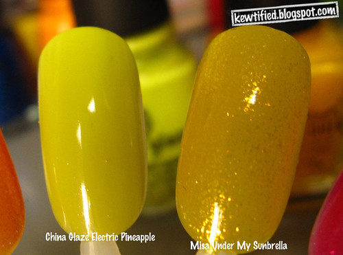
Electric Pineapple with Under My Sunbrella. In this picture it appears some of the yellow flakies from Under My Sunbrella has also migrated over to Electric Pineapple??
The Misa is a lot more yellow, while Electric Pineapple is all about a saturated, neon-ish yellow creme.

And here we have the blues: Krystal Water, Blue Iguana, Mermaid Dreams.
I thought this really cleared up where all the colors fall in the blue gradient scope. These polishes, combined, would make a GREAT gradient manicure I think!
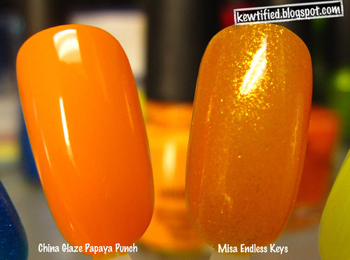
Papaya Punch with Endless Keys.
Easy to see they share the same origination, and are pretty close-knit already. I can’t believe I didn’t think to layer Endless Keys over Papaya Punch!! They were obviously meant to be. 😦 I don’t have Papaya Punch with me, and alas cannot test these layering ideas out. The CG Island Escape collection are all chilling in a Helmer, (safely I hope) in a storeroom up at DC.

Bottle picture of China Glaze Cha Cha Cha, Misa Mega Margarita, and Zoya Apple. When I pulled the China Glaze and Misa out, the shimmer and green made me think of Zoya Apple as a possible dupe. When I pulled it out, the answer is: it is clearly not. But I swatched it anyway, to give you ideas of their finishes, which vary a bit.

As you can see Apple has a strong golden foily feel, it catches and reflects a lot of light. Cha Cha Cha isn’t related at all in these two families– he’s the milkman’s kid. If you catch my drift. Neither is Zoya, but I wasn’t talking about Zoya.
And now here, the possible dupe:
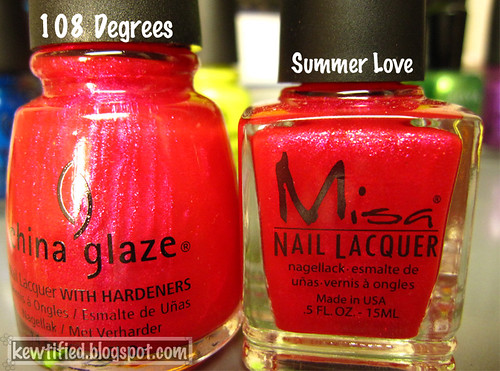
Bottle, side by side picture of China Glaze 108 Degrees and Misa Summer Love.
I am still a bit stuck on this one. They LOOK like dupes don’t they? They have the exact same hot-pink flash going on through the bottles, and of course the sheer dark-grapefruit pink base.
Well…

They are clearly not dupes. But I wouldn’t justify owning both. The China Glaze has a far superior formula and shimmer. The Misa has hot pink flakes scattered throughout, which the CG bottle lacks– again making it ideal to layer over a, perhaps, honeysuckle shade.
And, that’s all I have for you guys 🙂 I hope you enjoyed them.
The only regret I have is not layering them over each other! They look like perfect partners. What do you think? What combinations would you try out?


