Another Spring 2011 collection! I know 😛 This one I really like, it reminds me of Paris and walks through parks with a parasol. It’s a six piece collection with light colors and cremes, combined with a sheer pink-gold duochrome topper, Kisses & Bises.
All polishes had great formula except Nice is Nice, which I found to be a bit goopy. I’m pretty sure this is just a random bad bottle, the one I had at DC was much better and easier to control. They’re all two coats, and one coat of Kisses & Bises.
Let’s begin with my favorite… I have FOUR pictures of it! Haha.
Coat Azure! It’s an azure blue with a shimmer. 
See that delicate shimmer? 
With Kisses & Bises over it. 

French Affair, the namesake of this collection. It’s a pastel pink creme. Very delicate and beautiful 🙂 
French Affair with Kisses and Bises on top. This is one polish that I feel that Kisses & Bises just did not transform. All we see is a pale pink shimmer!

Topless & Barefoot. What a raunchy name 😉 It’s a cool tan neutral creme. Kind of boring until…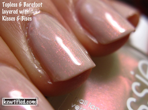
Layered with Kisses & Bises!
I like this effect, it’s like sun shining on wet sand on the beach… I NEED a trip to South Padre Island SOON.

Nice is Nice. A pale pastel lilac creme. 
I love this combo too 🙂 I really like this topper. 

Sand Tropez, a much warmer neutral than Topless & Barefoot. 
With Kisses and Bises. This combination really brings out the gold in K&B!