Archives for category: creme

Yes, that’s right for the price of One Pink Wednesday you get THREE! 😉
(Is it obvious that it’s just me trying to catch up on my backlog? Ehh.)

GothicLolita
Apologies for the terrible lighting 😦 The stamp was a semi-fail too.
Base color: OPI Sparrow Me the Drama (another lover for the name! hah!)
Stamping Color: Wet n Wild Black Creme
Stamp: Konad M59

The next week, I took out OPI Strawberry Margarita. It’s a bold, vibrant almost-honeysuckle pink creme, and layered that with China Glaze White Cap from their Anchors Away Spring 2011 collection.
PinkishGold_Accent
At first I couldn’t decide if I wanted it all matte, or glossy. So I tried an accent nail and then decided…

PinkishGold_Matte
All matte! Hehe.

And now for my final look…
RevlonLuxeLaque
For this one, I began with a coat of Revlon Luxe Laque, a dusty mauve-ish pink creme. It’s not on the range of Pepto Bismol, nor Barbie, but leaning towards almost pastel.

HannahPinktana
Then I layered Luxe Laque with Wet n Wild Hannah Pinktana, a scattered holographic glitter suspended in a clear base.
HannahPinktanaII
I think they go together nicely 🙂

Hi guys, I come to you with Essie Resort 2011 collection. You might have seen them at other blogs already, but I like this collection. I usually like everything Essie does, although I wish they would include a bit of more variety in their collections. There is often two or three shades of red/pink/orange. I guess it’s a color they do well 😉
This is a four piece collection with far muted colors than its sister collection, Braziliant. It really does remind me of a safari theme, I love it.
Formula was great, all opaque within two coats. I also love the names 🙂

Unlabeled_BottleSpread
From left to right: Fair Game, Your Hut or Mine?, Da Bush, Lion Around.

LET’S START WITH MY FAVORITE:
FairGame
Fair Game! I looooove this color omg. It’s such a beautiful smoky shimmery silvery grey! Holy adjectives batman.
FairGame_Detail
An excellent closeup. If this had a green flash, I think it could have been a dupe for Chanel’s Black Pearl (which I still covet.. le sigh). This does satisfy my lemming for Black Pearl in a way, but not my lemming to own a real Chanel polish 😀

YourHutOrMine
Your Hut or Mine? It’s a coral, with a shimmer– but this coral leans towards a “dark hot pink” (wow oxymoron much?).
YourHutorMine_Detail
The shimmer is like a pale gold. I’m not sure what but it’s lovely. Very thick formula o.O

DaBush
Da Bush. This is a sister to OPI’s Stranger Tides, and a lot of people find this more suitable for their skin. Myself I like both, but I should do a personal comparison to see which looks better on me. I’m a severe hoarder though and may just keep both 😀

LionAround
Lion Around
It’s a pale mauve neutral with a shimmer. It almost mannequin’d my hands but not really. This is also my least favorite, but maybe I need to go revisit it and see what’s the matter with it.

So you’ve seen the tape manis all over, and I read one blog that cut up tape using craft scissors. I thought this was a brilliant idea! It took me forever until I finally found my old scrapbooking bag, and finally used them 🙂

BlueCurtains
I began with a base of Sinful Colors Unicorn (wtf is with the name though? Unicorn reminds me of silvery colors.. not quite yellow haha). I cut up pieces of tape with my craft scissor, and painted on China Glaze Adore.

BlueCurtains_Wholehand
It’s so cool. Hardly can tell which color was painted on (ignore the fact I messed up with the pinky) and it kind of looks like theatrical curtains).

BlueCurtains_Closeup

A Spring collection in June?! I know 😛 I told you I was behind!

Without much ado, here is the collection! All of them, except Honeysuckle have a hidden silvery shimmer that’s lovely. It has your usual pinks, whites, greens, purples but with a much more murkier depth. I do like this collection 🙂 It’s an 8 piece collection accompanied with a glitter topcoat called Dewdrop.
I love Nubar’s formula even though I don’t use their polishes enough. I like the brush handle, the brush itself, and their formula 🙂 All were opaque by two coats, and Dewdrop was applied with one coat to all.

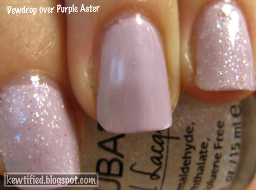
Dewdrop is a sheer polish, and impossible to become opaque because of its glittery nature. It’s packed full of gritty pastel colored round glitter and would need a topcoat to smooth things out. I did not apply a topcoat in this collection because 1) I don’t when I’m doing swatches and 2) I was on a swatching roll.
I found that Dewdrop looked best with more bolder colored polishes. With the dusty colors in this collection, a bit of them just looked gritty and dirty– not in a good way.

I will begin with the creme by itself, and then a picture of it with Dewdrop. I have all of them except for some reason, this one:
BabySprout
Baby Sprout
It’s not your usual mint green that you see in Spring collections. This is a murky, light pea color.
I forgot to take a picture/apply Dewdrop so no Dewdrop picture for this one. Use your imagination 🙂

PurpleAster
Purple Aster
It’s a dusty mauve lavender, and you can see its shimmer here. This one was okay, I usually love purples and everything else in its spectrum but I didn’t go nuts over this.
DewdropOverPurpleAster

Earthen
Earthen is a murky pale grey. To think of it, I wonder how this compares to Skulls and Glossbones by OPI. Hah! I like this one more, I think, it’s an interesting neutral.
DewdropOverEarthen
Not a fan of Dewdrop over Earthen.

PinkLily
Pink Lily
I brought this one home with me. I love it, it’s a perfect pastel pink with a shimmer.
DewdropOverPinkLily
I’m sorry about the lighting change, lol. This is more accurate to the bottle color, however. And now you see how flattering Dewdrop can be.

YellowPrimrose
Yellow Primrose
A pale pastel yellow, could be mistaken for white.
DewdropOverYellowPrimrose
Reminds me of Easter. I also like this combination a lot. =)

BlueHydrangea
Blue Hydrangea
Baby blue pastel. Reminds me a bit of Essie’s Borrowed & Blue– in fact, I wonder if anyone could do a comparison? I don’t have this one home with me. 😦
DewdropOverBlueHydrangea
You see a lot of the yellow glitter here.

WhitePeony
This is a perfect white! It’s off-white, but not yellow to the point where it’s ivory. A lot of white polish tends to be streaky or runny but not this one. It makes my eyes hurt looking at it and trying to figure out what makes it “not white”. Haha =P
DewdropOverWhitePeony
White Peony also is a good base to show all the colors of the glitter in Dewdrop =)

Honeysuckle
Honeysuckle
MY FAVORITE! I don’t like a lot of pinks, but this is a GREAT color. It’s so beautiful! It’s also a true creme, unlike the other 7 polishes. I have worn this twice, and that is unusual for me. 🙂
DewdropOverHoneysuckle
with Dewdrop. I have to say I like this by itself, but it also looks good with this topcoat.

Nail Wheel Over White
Yep, we’re revisiting the CG Island Escape Summer 2011 collection. Why? Well, when I swatched them here a bit of them showed up sheer. Some of you commented and shared the same sentiment about disliking the amount of VNL we were all seeing.

I decided to layer them all over one even base of white polish (In this case, it was my China Glaze Snow, or my “white-out” as I call it XD) It only took two coats to achieve full opacity and near bottle color!

I think it is worth it, the white base really brings out the gorgeousness of these polishes. I would have done 3 layers with a single Island Escape sheer, and still had VNL anyway. Basically, the same amount of layers but with an extreme amount of bling!

Here’s some more close up comparisons of the swatched over white and the old swatches on my nails with all its VNL glory.

Starting with the cremes, and the ones I was “uncomfortable” with.
Papaya Punch
Papaya Punch
On my nails, without a white base, it looks a bit more of a light papaya color. With the white base the orange is brought out much more strongly, almost mango.

Electric Pineapple
Electric Pineapple
Washed out yellow, but over white it almost is neon. It comes pretty much to life.

108 Degrees
108 Degrees
108 Degrees was not exactly a “sheer” polish, I did achieve full opacity with three layers (of course) but it just looks a lot more yummier over white. You can see the silvery white fleck glitter here.
(and why do animal hair always haunt me?! This was in a pet-free DORM room. agh).

Blue Iguana
Blue Iguana
Sorry about the dent. This one I was not able to get a very good picture of. Over white, I achieved a more bottle color rather than the paler blue that is being shown on my nails.

Senorita Bonita
Senorita Bonita
On my nails the pink fleck shimmer was almost undetectable, and it pulled too pink in the photo. The nail wheel swatch, over white, is definitely ALMOST (haha, an oxymoron. See what I do?) color accurate. This is a hard color to capture. Anyway, over white, the pink shimmer showed through so much more strongly and confidently. This was a color I had always looked forward to when I first heard of the collection, and was disappointed to find how “meh” it looked on the nails 😦 However, over white, it’s revived some of my original faith and love in this color.

And my favorite, layered over white:
Cha Cha Cha
Cha Cha Cha!
I was “meh” about it when it was on my nails, but over white? OMG. If I didn’t have so many untrieds, this would be my “go to” color. Hell yeah!

Now, over white, I would suggest/recommend these polishes even more! 🙂 It is not much trouble for me to layer them, and I do enjoy layering polishes to achieve bottle color. The only thing I have to watch out for is making sure the white was applied evenly and is not “too” wet when I apply the first base of color on it, or else it will become a draggy, streaky nightmare. We don’t want that.

Design a site like this with WordPress.com
Get started