So being a Texan I had to pick up the collection and see for myself this “sorbet” finish. This is going to be a huge post with swatches and whatnot 😛
We have the sorbets here. Oh look.. Don’t two, maybe four, of them look SIMILAR already??
The … not sorbets.
FYI: The sorbet shades were dry when their pictures were taken. I do like this finish, I can imagine it would look adorable on toes and nubby fingers. With my kind of long nails (they’re not that long, but if I can’t take my contacts out easily– that’s long to me :P) I had an issue with the visible nail line– three to five coats each for the sorbets just to have some coverage!! Anyway, this finish makes you look like you have constantly wet nails– the finish is very “juicy” and like some bloggers say, between a creme and jelly. I’m not saying it’s juicy just because this finish is named sorbet, not at all…
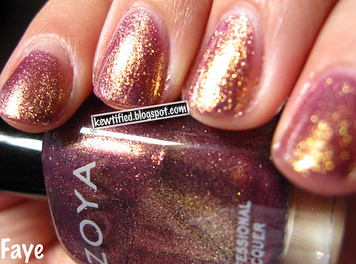
Onto the swatches!
Guy Meets Gal-Veston.
Ok I’ve been to Galveston and it doesn’t deserve a pretty shade like this. It’s a berry, definitely– berry with a hint of orange/pink? Grapefruit kinda shade.
Too Hot Pink to Hold ‘Em
In the bottle it appears to be a cherry red sorbet, but again, appears pink on the nail. In the line up picture up on the top, this bottle is on the far right and it’s pretty color accurate.
Big Hair Big Nails.
This color is TOTALLY a dupe for Guy Meets Gal-Veston. I’m incredibly disappointed with OPI for this– did they just not want to release 11 shades so they stuck in another bottle of the same color and slapped on a different label?? I will prove it’s dupe-ness in a second.
Houston We Have a Purple
The color in the bottle is accurate, it’s quite grape.
Do You Think I’m Tex-y?
This is a cherry wannabe, but I found it to appear purple on the nail and it seemed to me, similar to Houston We Have a Purple up there.
Y’all Come Back Ya Hear?
Chop job, the thumb picture is the most accurate color.
YAY an orange! It looks delicious, and I want to eat it. I’m thinking this would be adorable on the toes in the summer. I actually love this shade.
I think the problem with this sorbet finish and OPI’s insistence of releasing a “gradient” of pink to purple shades is that they all end up very similar on the nail. I think out of every one, Houston We Have a Purple and Y’all Come Back Ya Hear? are the most unique ones. The other four could look similar and nobody would ask you or comment if you wore a different color on each nail.
Now the not-sorbets:
I Vant to be a Lone-Star
This is the most color accurate photo I could take of this enigma. It’s cool!! It’s grey, with white and silver shimmer. In the bottle it looks blue as you can see, but appears silvery on the nail.
San Tan-tonio
Kind of looks like poop in this photo, but on the nail it’s interesting. Not something I would pick up, but it’s dusky and reminds me of the Texan ranch I grew up on… (What ranch? Yeah right :P)
Don’t Mess With OPI
This is a nice forest green creme, however I’m not sure how unique this is. I’m already having ideas of its twins.
Suzi Loves Cowboys
I love this brown! It’s just a brown. Not purple brown, black brown, tan-brown.
It’s Totally Fort-Worth It
Check out that pink shimmer! It’s a grey duochrome, with pink shimmer hiding in it and in the bottle the pink definitely flashes. A lot of people like this for layering, and it’s pretty sheer.
By the time I got to this (It was the last bottle I swatched) I was just tired of painting the whole nail and just did my thumb 😛 You can see my naked nails in the background!
Austin-tatious Turquoise
I don’t understand this name very much, but whatever. It’s a pretty color but very, very sheer. You can see I missed some spots when applying the three/four layers, and there are bald spots on my thumb. If the formula was thicker, I think I would like this color more, it’s pretty accurate of Austin.
NOW THE DUPES….
I dare you to tell me which is Big Hair Big Nails and which is Guy meets Gal-Veston!! Even I couldn’t see it AT ALL in person. Give up? It’s okay, I did too.
Now that you see it, Big Hair Big Nails is “slightly” darker than Guy Meets Gal-veston but whatever!! When getting this, just pick the name you like better. They’re exactly the same, I swear.
As for Houston We Have a Purple and Do You Think I’m Tex-y? I thought they might be dupes so I checked..
Not really. Houston We Have a Purple is definitely a lot more purple than Do You Think I’m Tex-y? which is much more red.
While I personally love the sorbet finish, I just wish they threw out a blue or a green to replace two of the four very similar colors. 😦