Hi guys, I have here for you Essie’s Summer 2011 collection, the counterpart to their Resort 2011 collection recently. This is a six piece collection featuring really hot colors– and I mean they are hot! 😉 Most of them have hidden shimmers, and FOUR polishes are in the red-coral-pink family! I guess I’m okay with that because… Great pedicure colors. That said, I need to do my toenails sometime soon. I’ve been so lazy about it- they have been naked for about a month!
Before we start, let me tell you- my camera hates bright colors, so the pics are a bit crazy but they’re color accurate for the most part, at least on my monitor.
Formula was flawless, a la Essie. Two coats for all. Great names!

First up is Super Bossa Nova. It’s a hot pink with a great shimmer. 

Smooth Sailing. The love of many nail bloggers. As you can see mine bubbled a bit, but that may just have been due to rough handling. Yes, I said rough handling. My bottles get dropped a lot and jostled around. 
This is lovely, though. These two pictures above pull a tad too blue. It’s a perfect periwinkle, I think, with light blue flecks running through.

Too Too Hot. OMG My camera hated this! It’s a hot red creme. I like to put the crazy colors on my toes because everything looks good down there! (What she said LOL)

Meet Me At Sunset. What’s up? Burnt orange creme. Or is that called burnt sienna?? 
THIS is the most color accurate.

Absolutely Shore. Pale seafoam green. The bottle I had was a streak fest =\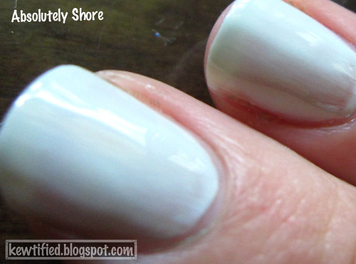
I need to revisit this one and see if I love it. So far it looks like a leave it.
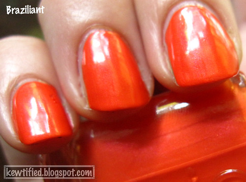
Finally, the namesake of the collection! Braziliant is one I really like, too. It’s a hot orange with a great shimmer. 
Check out that awesome shimmer 🙂
What did you guys think? Will you be grabbing any? Or leaving it? I saw these at Target!